PIEDRA DE AGUA.
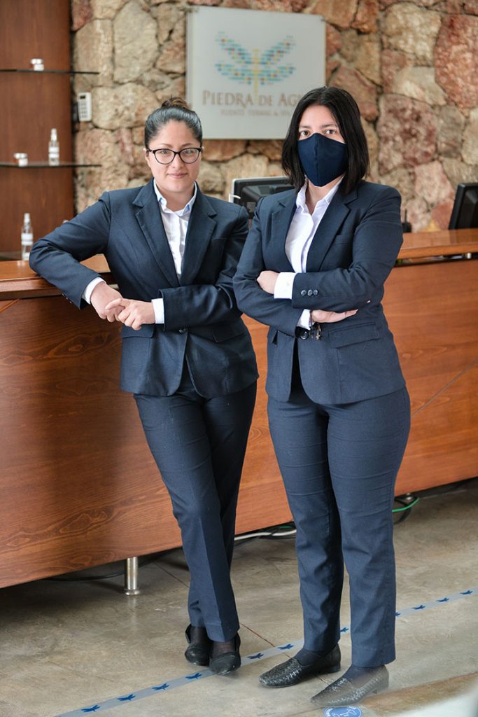
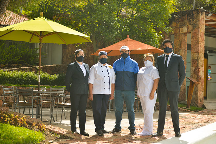
‘Piedra de agua’ is a one of a kind spa center with volcanic water pools, volcanic mud pits, massage services and a restaurant. It is one of the most important touristic destination in Cuenca.
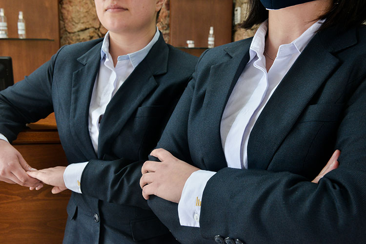
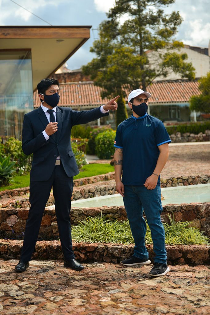
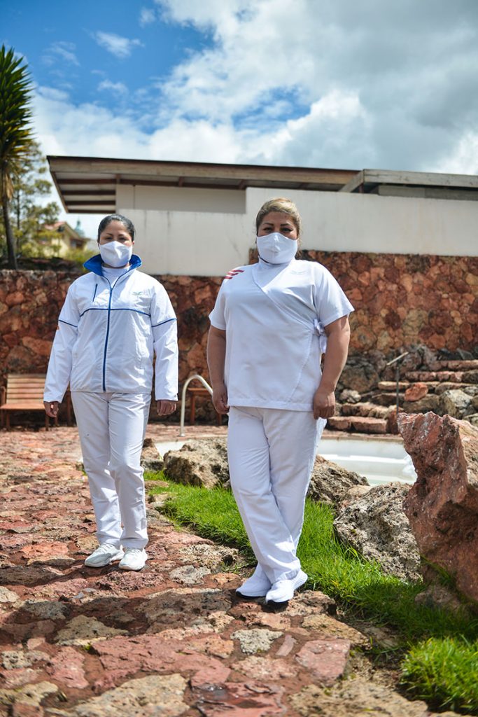
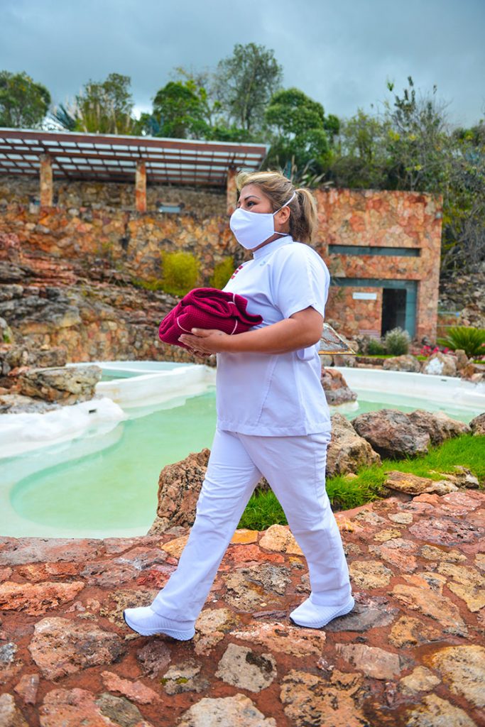
This is one of the most complex and elaborated projects we have worked on. There were many variables to be analyzed regarding job descriptions, group requirements and most suitable materials to be used.
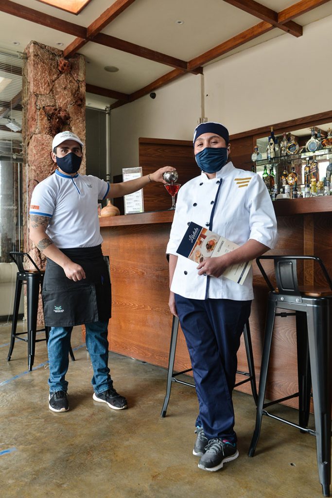
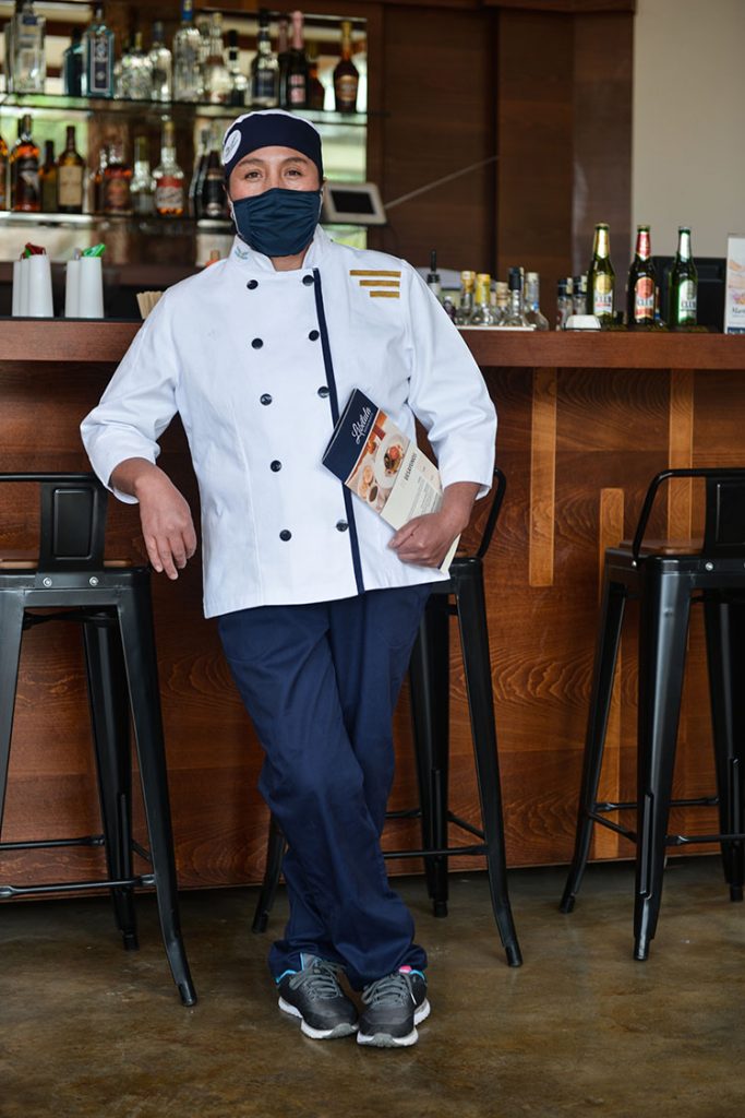
We developed uniform typologies for each area, making sure our proposals would work and be comfortable in each individual situation.
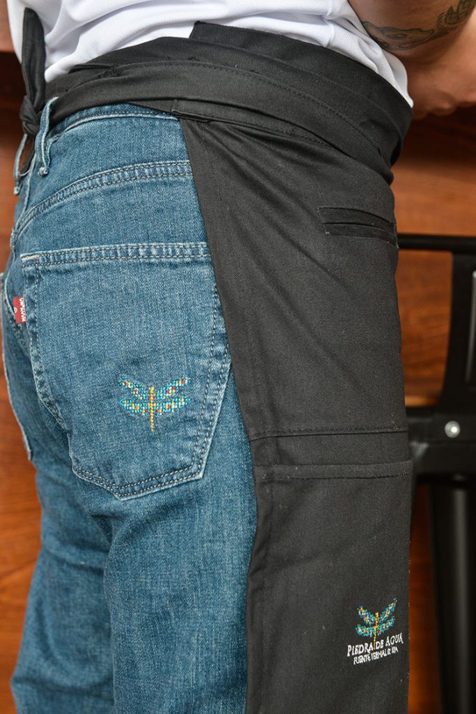
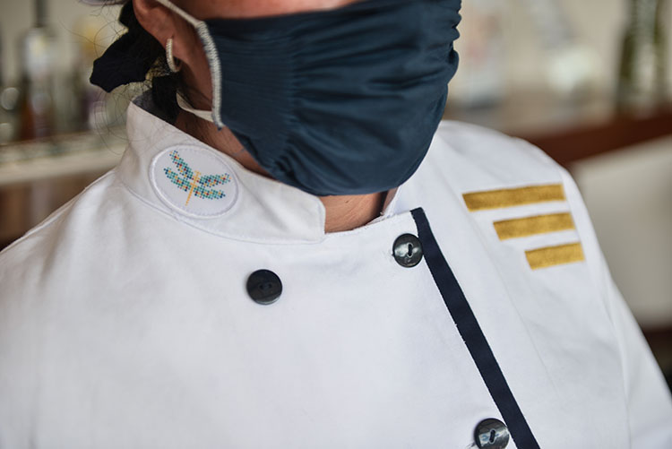
For these uniforms we created an elegant silhouette in neutral shades of white for cleanliness, blue from the water and detailing in warm colors taken from volcanic shades.
It was important to highlight the company logo, a firefly, on different positions of the uniforms.
CEMSI.
CEMSI is a medical center created to give health services of the highest standard.
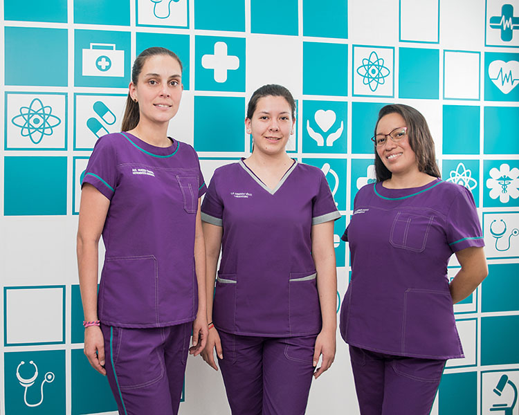
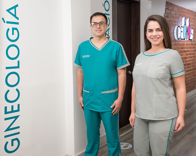
For the design of these uniforms, we considered comfort, freshness and protection of the doctors, nurses, dentists and patients.
We used antiseptic, easy to clean fabrics of the highest quality. Color was central to the design proposal. We used turquoise to emote peace and tranquility. Violet for spirituality. Light gray for light, clarity, cleanliness and eternity. And white for purity, angels, light and creativity.
This way, we took advantage of the brand identity in a visual fashion with clean and asymmetrical cuts.


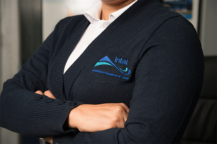
INTAL – ADE.
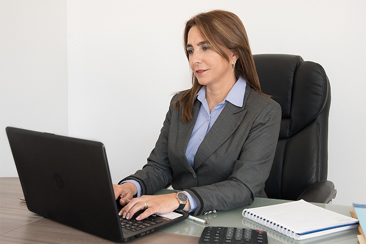
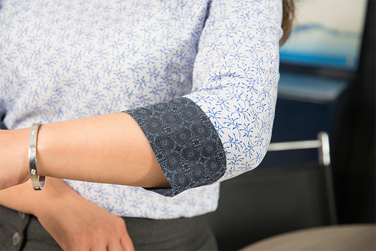
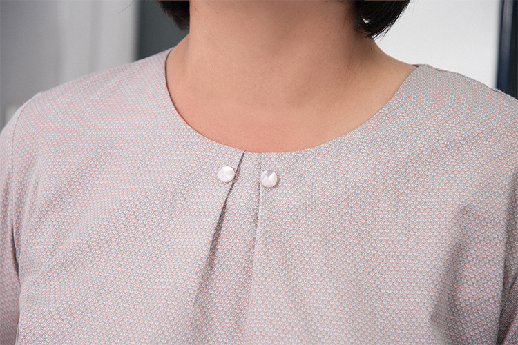
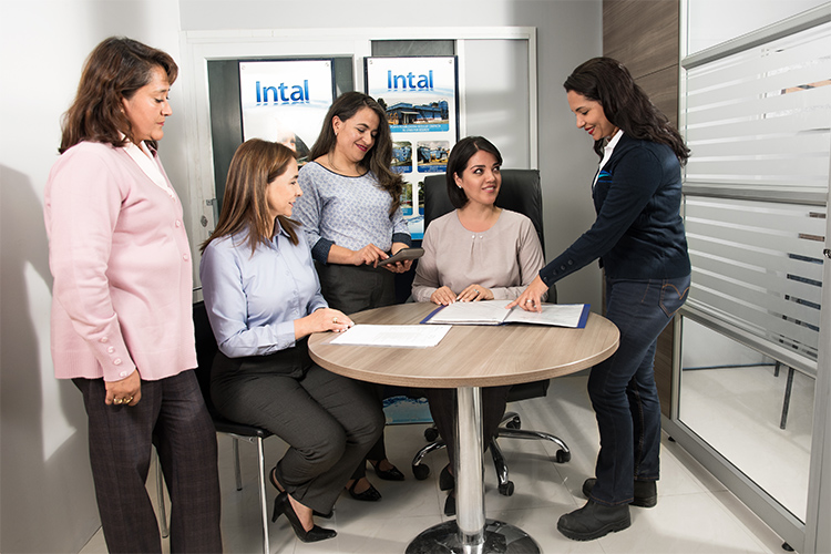
This prestigious company required uniforms for their corporate and field staff. We proposed a classic silhouette with hints of pastels to break formality.
The concept behind these uniforms was to use basics such as trousers and blazers mixed with different shirt styles to have different looks within a coherent language.
Trousers and blazers were made in cashmere, shirts in silk, cotton, jersey or denim.




MONTE BIANCO.
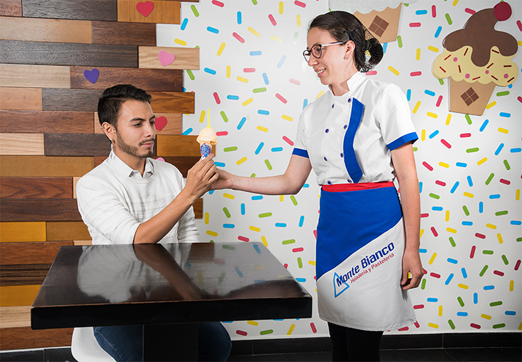
This was a nice project for a company which makes and sells ice cream and cakes in Cuenca. The company wanted to restructure its corporate image and branding.
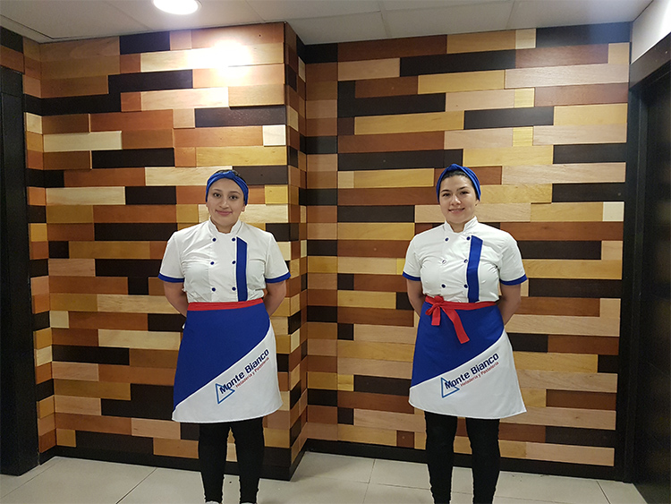
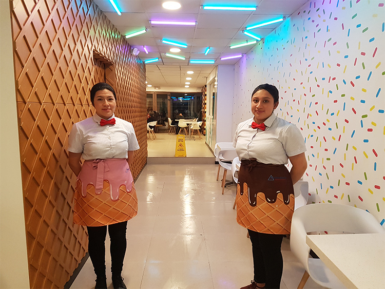
One of the goals was to create a thorough experience for the client and the best way to achieve this was by making them feel important. Employees, being a key element, need to appear at the forefront. This was managed by corporate uniforms, following a graphic design line which incorporates the values the company wants to communicate.
The uniforms were designed based on the needs the employees had; good quality, lightfast and weatherproof fabric. Aprons and blouses were designed using the same principle. The design in the uniforms is cohesive with the interior design, finding inspiration in ice cream and cones. These patterns are etched on the aprons mixed with checked shirts and bow ties. For the second uniform, we wanted to project a professional image and decided on a traditional chef jacket in asymmetrical cut in shades of blue and white; adding the company logo.

LA BARBERIA.
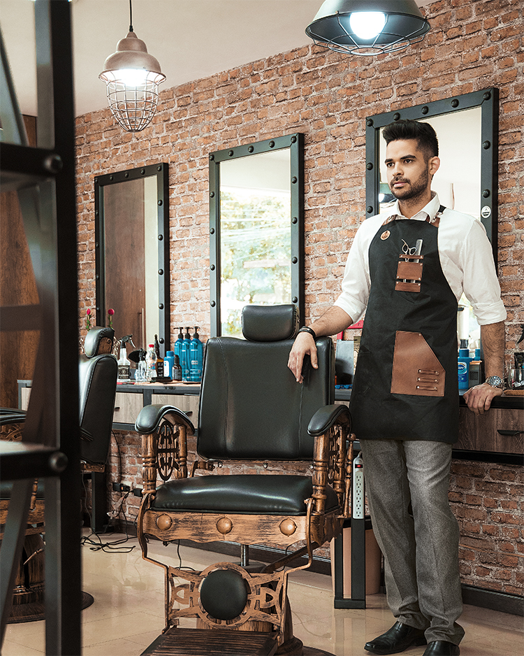
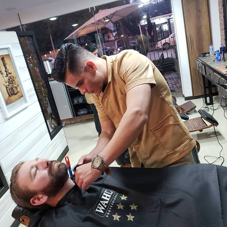
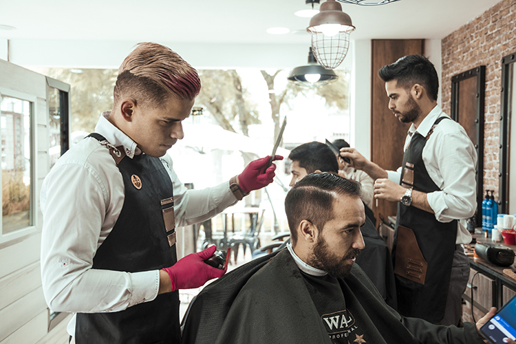
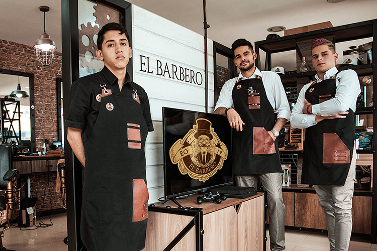
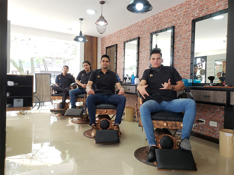
The design proposal was based around their general design concept. We worked on the idea of ‘Steampunk’ which is a sci-fi aesthetic movement revolving around past conceptions of the future.
This concept was worked into graphic, interior and fashion design; creating a very visual conceptual line.
We designed aprons and smocks, over imposing different textures and fabrics such as polypropylene, faux leather and cotton. We detailed asymmetrical and multipurpose pockets for the different tools of the trade.
FROGS.
Being one of the first Lounge-bistro in the city, we decided to use the company name and the golf range overlooking frog ponds as inspiration.
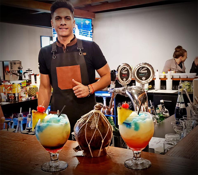
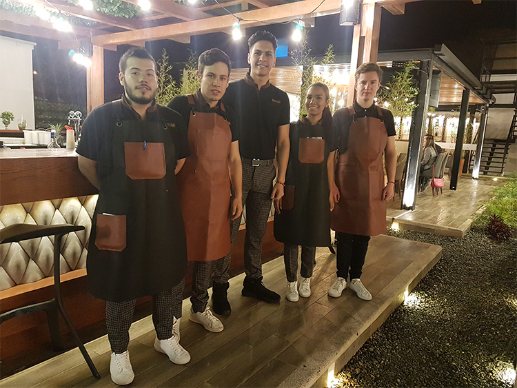
Our goal was to satisfy our client’s needs. They required for the uniforms to be casual, sportive and trendy. This idea fitted perfectly with the concept behind a golfing attire. We proposed black cotton polo shirts with brown suede details and checked pants in black and gray rayon.
Aprons were double faced so that you could change the look by just flipping the apron. One side was made in brown faux leather and the other black polypropylene with brown details.
Colors were picked off the company logo and interior design to have a cohesive look.
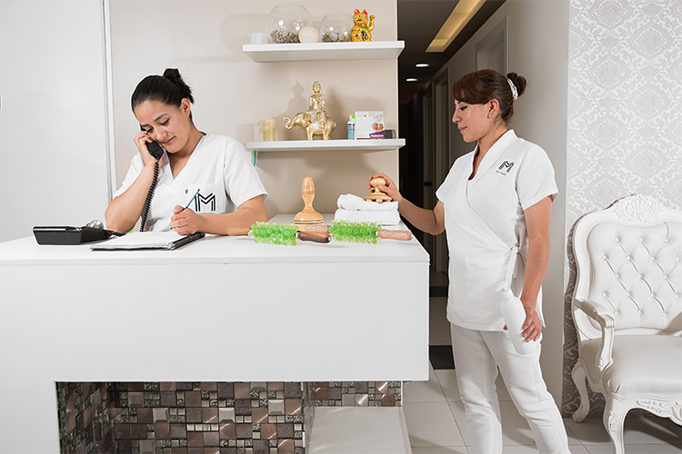
MM SPA & ESTHETIC.
This welcoming spa gives their clients the best attention, devoted to make them pretty and healthy.
The spa asked us for comfortable, easy to clean uniforms in a very streamlined design.
For this project we worked with asymmetric and minimal lines in a technical fabric in white for easy cleaning.
